
CONDÉ NAST
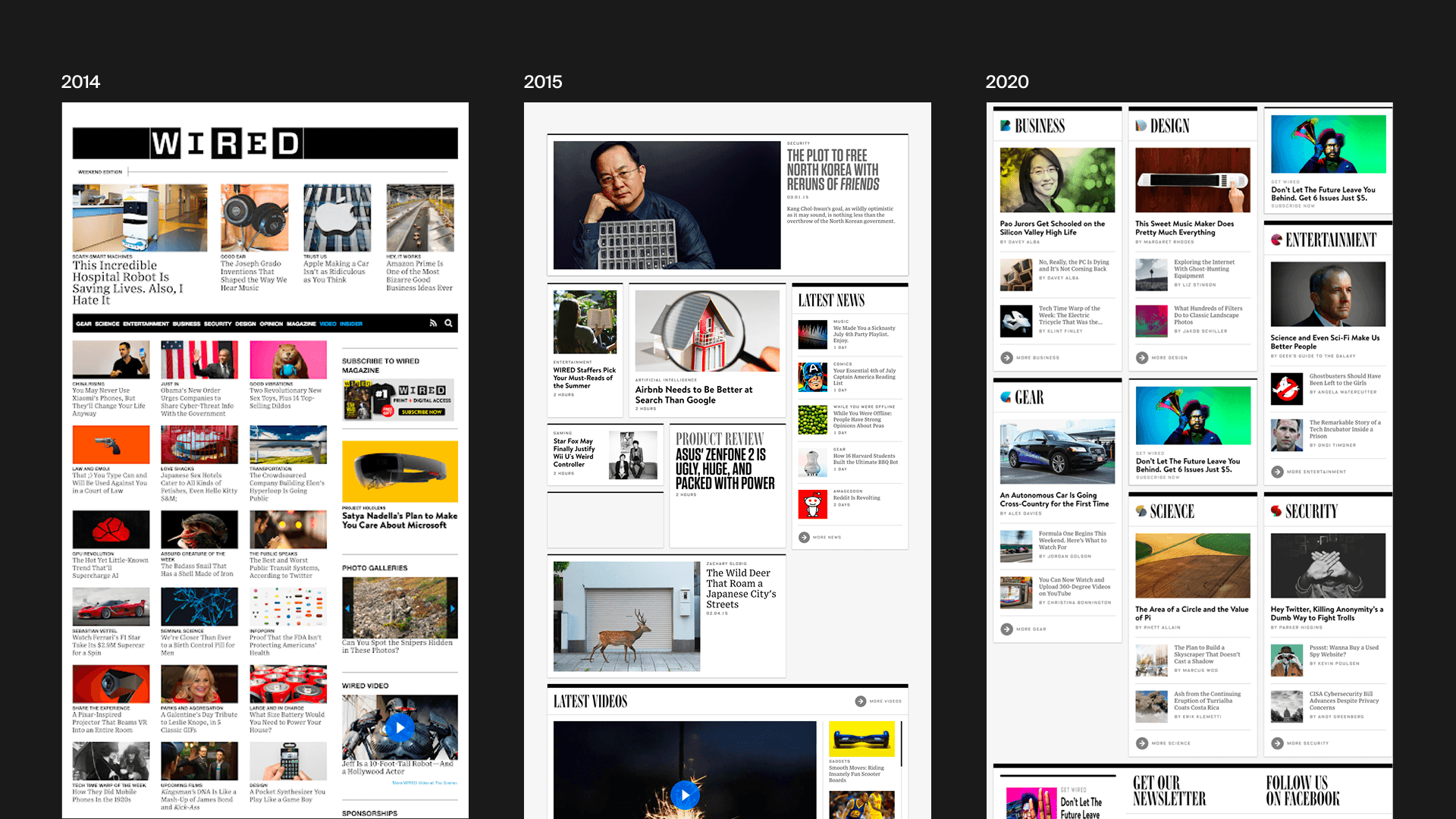
WIRED, Homepage
Redesigning the WIRED homepage with a focus on rejuvinatating direct visitation, increasing on-site conversion, and creating space for new editorial initiatives.
The Homepage is Important
The WIRED homepage performs a crucial role for the business by building loyalty and advertising the breadth of the publication's offerings. People who reach the homepage tend to engage 2—5x more than others on-site, and many of them are direct visitors that are significantly more likely to convert to subscribers
In late 2020, a company-wide effort was underway to centralize all of Condé Nast's digital properties onto a single, unified design system. Because the WIRED homepage was sitting on legacy technology, any meaningful iteration had been paused and development teams were focused on optimizations elsewhere in the portfolio. An upcoming internal global merger added additional pressure to accelerate the re-platforming of the site, and we were presented an opportunity to design a page that better served readers, editors, and the business.
Gathering Inputs
A generalized research effort had been underway to better understand what role WIRED was filling in the lives of its subscribers, as well as identifying opportunities for growth. The UX Research team performed interviews with a range of reader types and shared what "jobs" WIRED was performing for its most loyal readers.
Quantitative input in the form of behavioral data and usage patterns revealed that for engaged readers, visitation patterns have been roughly unchanged for the last 6 months. More critically, while site visitation has been climbing, homepage usage had been dropping overall—and the total share of traffic to the homepage had been declining for over a year.
In addition to these high-level research findings, our team gathered feedback from an on-site input form and surveyed WIRED's editorial staff to learn about stakeholder ideas and expectations entering into the project.
We learned from editors that they often struggled with the somewhat arbitrary structure of the page, felt there were many onerous requirements for organizing stories into immovable modules, and a general frustration that the current design failed to do justice to the writing or photography of many stories.
Initial Concepts
Our team used all of these inputs to craft a simple and communicable objective ("Make WIRED"s homepage a daily destination for more people") alongside a handful of design principles to ensure stakeholders were aligned on what a successful end-result should look like. Using these tools, we facilitated a workshop to begin the process of identifying concepts that resonated with the team.
Key findings from the research led us to two hypotheses that translated into distinct approaches to content organization, structure, and labeling. We created low-fidelity wireframes and brought them into interviews with a sampling of WIRED readers to collect feedback.